Lesser The Flow More The Temperature
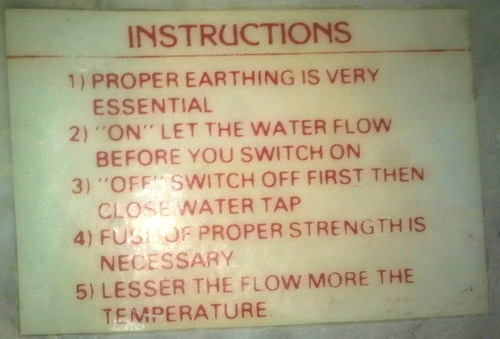
This little plaque is attached to a water heater in Mansi's family home. Given the lack of safety features the first four instructions are unsurprisingly all about not killing yourself. It is an electric heater so make sure it is grounded (1). Due to an erratic power supply there should be a good fuse (4). The device does not have an automatic pressure relief valve so it is important to make sure pressure can not build up (2 and 3) which could lead to an explosion.
The last instruction however is interesting and is there because the heater does not have a storage tank. There is only a single faucet which controls the rate of water flowing through the pipe. Water flows directly from the holding tank on the roof, around the heating elements and out of the faucet. Therefore, the temperature is inversely proportional to the flow, hence "Lesser the flow, more the temperature." Once, as I was waiting for a bucket to slowly fill with hot water, I started to think about how odd it was to see this relationship explained in text rather than some sort of graphic.
Inspired by more standard patterns such as:
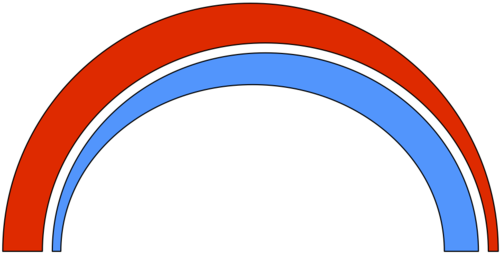
Why not something like:

Due to the generally warm temperatures in Mumbai, I use purple to represent the higher flow end as even without heating the water is room temperature. The question then, is the graphical depiction more, less or equally likely to get the point across than the text version?