Thinking inside the box on a whiteboard


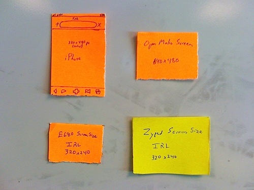
I was recently asked to talk about the process I use when designing mobile applications. One of the biggest things about designing output for mobile screens is keeping actual screen size in context. At the same time, I want the expanse and quickness of a whiteboard to use for my brainstorming. So what I do is:
- Cut out a piece of paper to the physical dimensions of the screen
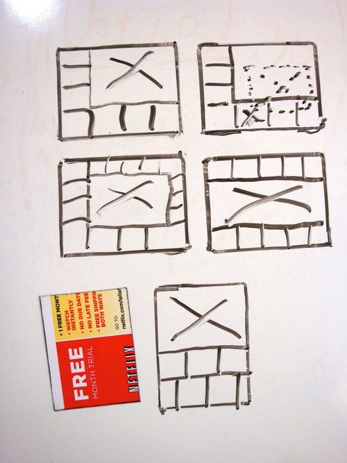
- Use it as a template to draw a bunch of empty boxes all over the whiteboard
- Use boxes as stills in a storyboard of interaction
The photos show the templates I have on my whiteboard right now and some of the designs I created for the Mobiphos project before I wrote any code.